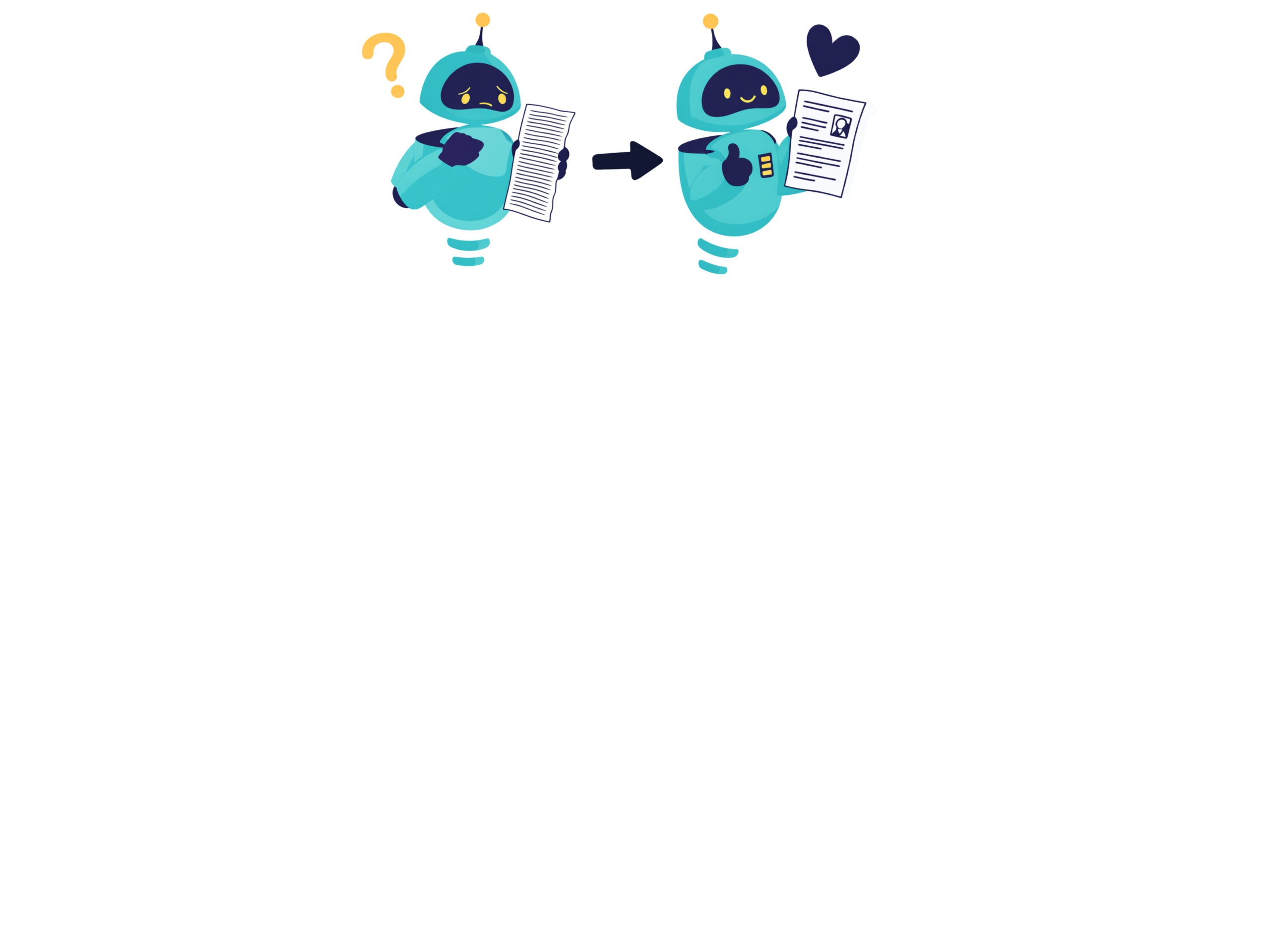
The Visual Plain Language Guide began as a doodle. I sketched a triangle between a reader, the form we were trying to improve, and the cumbersome process behind that form. I was trying to explain that plain language isn’t just about choosing shorter words or trimming complex sentences. It’s about removing friction between the reader and the message. Just like that the idea was born to create the Visual Plain Language Guide. The goal was to make clarity visible! (Find the Guide in our Resources Page).
This post walks through how the guide came to life: the problems it aimed to solve, the research behind it, and the design decisions that shaped the final framework.
Why I Created the Visual Plain Language Guide
The guide began from a simple question I kept getting in workshops, client projects, and conversations with other communicators:
“Plain language makes sense in theory — but how do I see it?”
Plain language is often taught as a set of writing rules, but what I witnessed repeatedly were moments of visual confusion:
-
text structured in ways readers couldn’t navigate
-
ideas buried because the hierarchy didn’t guide the eye
- information mapped in the writer’s mind, but not for the reader’s brain
Those who know me a little know I am BIG on cohesion and coherence–the visible links and the underlying clarity of thought that go into good writing. So I set out to show, even if a little, how these come to life. And I started sketching. I started with my existing RAISE™ wheel and it all evolved from there.
Those sketches became motifs: the target for goals (page 9), the puzzle pieces for flow (page 22), the hand and heart for empathy (page 23). Eventually, they evolved into a unified visual language to communicate the concepts of plain language — not within design, but through design.
A Visual Guide — Not a Design Guide
One thing I want readers to understand is: This isn’t a guide about visual design. It’s a guide that uses visual design to teach plain language.
Every icon and layout choice serves a conceptual purpose:
-
The RAISE™ principles wheel (page 6) represents balance and interplay.
-
The quadrants of clarity (page 7) visualize the differences in clarity and gobbledygook for lay and specialized communication.
-
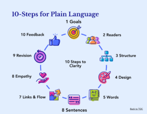
The 10-step circular diagram (page 8) positions clarity as an iterative, non-linear process.
I didn’t set out to create a “pretty PDF.” I set out to make abstract principles visible and memorable. In the Visual Plain Language Guide, each visual is tied to a principle or technique for making communication easier to find, understand, and use.
How the Guide Took Shape
Here’s the development journey behind the scenes:
1. Grounding the guide in international standards
Years before the ISO 24495-1 Plain Language Standard existed, I developed the RAISE™ model—Relevance, Access, Intelligibility, Suitability, and Efficacy—as a practical way to explain what makes communication clear. It grew out of years of observing where communication breaks down and noticing that “understanding” isn’t one thing; it’s a combination of how clearly something is expressed (intelligibility) and how well it fits the reader’s needs and context (suitability).
When ISO began drafting what would become the first international plain language standard, I was invited to join the technical committee responsible for shaping it. It was remarkable to see how closely the developing ISO principles aligned with the structure I had already been using in RAISE™—even though the model predated the standard.
The only real difference is conceptual emphasis. ISO includes “Understandable” as one of its five principles, while in RAISE™ that idea unfolds into its two essential dimensions:
-
Intelligibility — the clarity and precision of the expression
-
Suitability — the appropriateness and resonance of the style for the intended readers
Together, they capture what understanding actually requires in real-world communication: clarity expressed in a style that meets readers where they are.
Because of this natural alignment, RAISE™ maps cleanly to the ISO standard, allowing the guide to stand on an internationally recognized foundation while preserving the nuance, depth, and reader-centered structure that originally inspired RAISE™.
2. Turning research into approachable visuals
Once I knew the guide needed to show plain language, not just explain it, I returned to the research. Studies on cognitive load, reading behavior, and visual processing all point to the same truth: people understand faster when information is paired with clear, meaningful visuals. Not decorative visuals — but visuals that orient, anchor, and reinforce meaning.
So I began developing a visual vocabulary for the guide: a system of icons, metaphors, colors, and spatial patterns that help readers grasp concepts at a glance. Every visual decision had a purpose:
-
The magnifying glass + lightbulb + gear (page 4) conveys “find, understand, use.”
-
The audience icons (page 12) show diversity without over-specificity.
-
The color palette leans friendly and modern — bright but soft, not childish.
The visuals aren’t decoration; they’re cognitive scaffolding.
3. Building a structure readers can follow at a glance
The guide mirrors the very principles it teaches:
-
Clear sections (Goals → Readers → Structure → Design → Words →…)
-
Consistent iconography
-
Headings that double as meaning cues
-
Logical flow from “thinking” steps to “crafting” steps to “refining” steps
This scaffolding is visible on nearly every page, especially the 10-step cycle on page 8 of the Visual Plain Language Guide.
4. Iterating through testing and feedback
Just as step 10 of the guide emphasizes Get Feedback (page 27), I moved through several cycles of:
-
testing concepts with writers and editors
-
adjusting language
-
simplifying visuals
-
refining metaphors
-
tweaking contrast and spacing
Each iteration made the guide more coherent, lighter, and more intuitively navigable.
Why the Guide Looks Playful
Plain language can feel rigid or even simplistic. I wanted to challenge that perception.
That’s why the guide uses:
- rounded icons, not rigid lines
- asymmetric silhouettes, giving movement and energy
- vivid colors that signal friendliness
- visual metaphors that feel human, like the helping hand or warm lightbulb
This visual tone embodies the empathy at the heart of plain language (step 8, page 23).
Icon System Inside Visual Plain Language Guide
Here are the icons for each of the ten steps of the Visual Plain Language Guide.
What the Visual Plain Language Guide Aims to Do
Ultimately, the guide is meant to:
-
make plain language principles more teachable
-
help teams create better documents, services, and policies
-
support trust, clarity, and usability (page 29)
-
show that communication can be both rigorous and inviting
In other words, the guide exists to turn the journey from ideas to results (page 33) into something clearer, lighter, and more human.